


Creating colour palettes might be my very favourite part of any project. I sometimes think that if you can nail the palette, the artwork kinda creates itself.
So how do I find the right colour palette?
The short answer is: I let someone else find it for me. Specifically, I let Sanzo Wada find it for me. You can too.
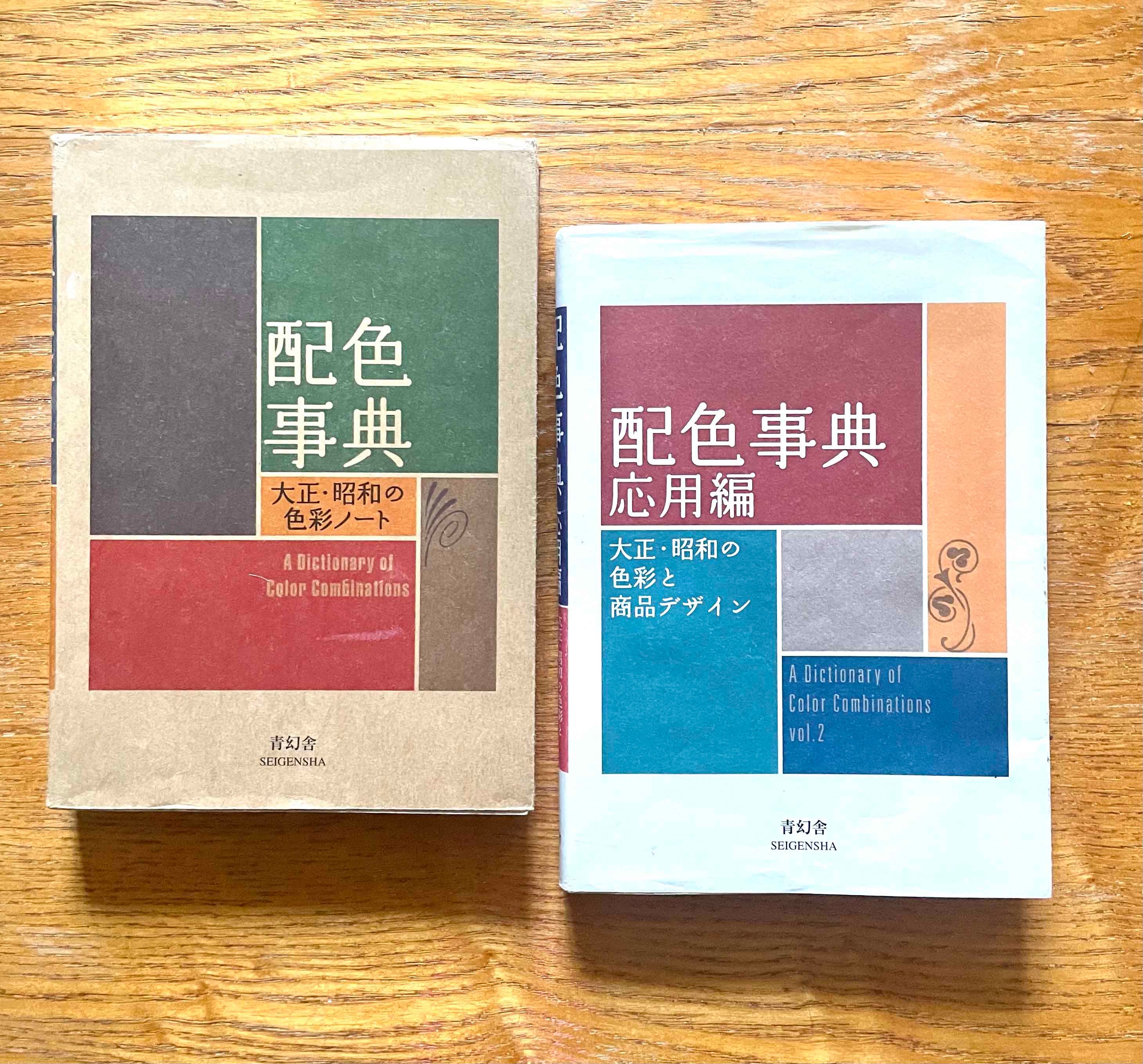
These beautiful books are both a pocked-sized archive of 20th century Japanese design and an interactive colour chip library. Take a look:
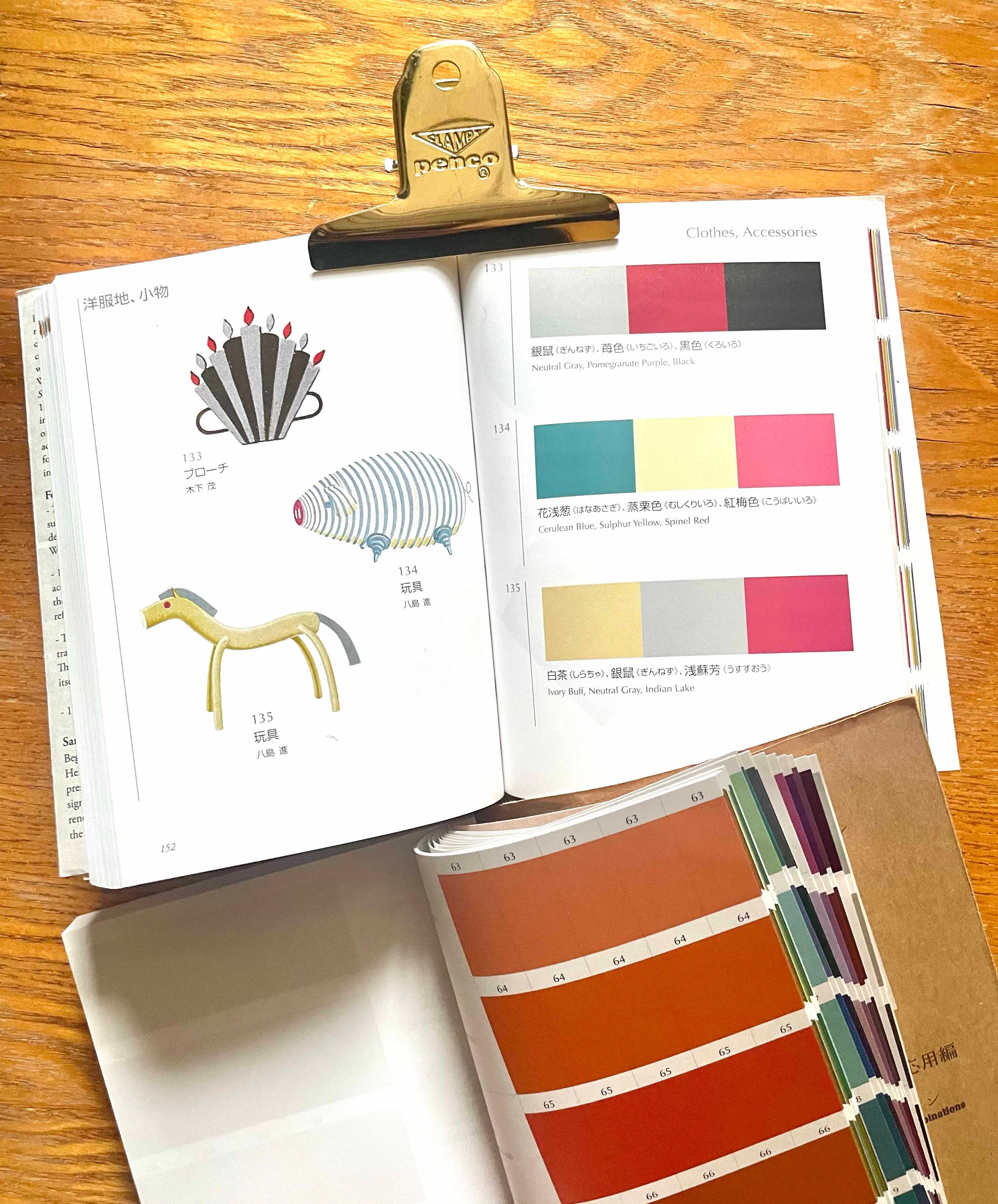
You can browse and borrow from the existing palettes, or cut out the chips to combine and test your own. Each colour is also provided with the CMYK values so you can get the exact colours on your digital devices
When I did the first colour sketches and mood boards for TINY DOGS, I combined the chips until I was happy and felt that the palette 1) told the story I wanted, and 2) was nice for your eyes to look at 👀.
You can see it in my sketchbook here. I was exploring the setting of the family home and also the characters themselves.


I got my copies of The Dictionary of Colour Combinations here, but you can find them in other bookshops. Ask your local indie to order them in for you :)
So that’s my quick secret. I hope it was useful. These books give me so much inspiration and are (importantly) extremely fun to use.
Do you think you’ll try this yourself? Tell me how you come up with your colour combos.
If you’d like to see how other illustrators approach colour palettes, check out
here and here.Look out for more behind the scenes tips and studio tea coming soon ☕️
Ooh - I love the peeks into your sketchbook and how you chose palettes for your book! Thanks for sharing.
I want to buy these two books for a while. They seem super useful. Also for the daily practice. I use in the moment traditional media caran d’ache pastels neo colori 2 they come in a box of ca 84 colors. It’s super helpful to be limited. All the colors are matching nicely together. Defunding a Color palette is a very favourite part of a project for me too. Thank you for the wonderful post.